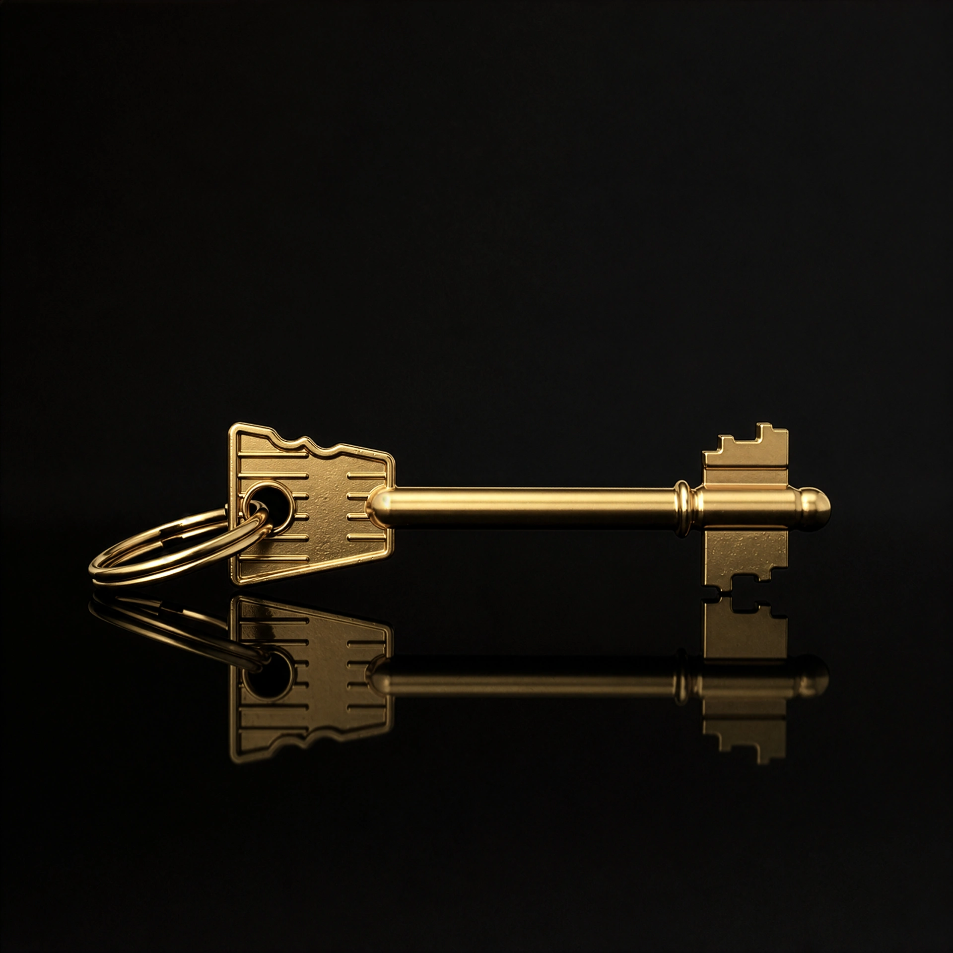
In the world of real luxury, where logotypes give way to the restrained elegance of the quiet luxury current, details become the final test. One of the most merciless verifiers of production compromises is paper. Mass-produced objects, though covered on the outside in deep black, reveal their workaday nature the moment they are cut – a jarring white edge. For an aware aesthete that small visual discord instantly strips the object of its magic. Uncompromising luxury begins where the material is authentic all the way to its core.
Why do white edges spoil the perception?
Printing black ink onto white paper is standard practice in the trade. Handling a premium product made that way produces a subtle dissonance. Research on the role of touch in judging products shows that what we feel in the hand affects the judgment of the whole object – and the edge is the first place a finger touches.
A white edge says outright that the black is only printed – and that one place undermines everything the maker declared with the finish of the face. Handing over an object that pretends to be something it is not is an image trap. If we settle for mediocrity, we begin to tolerate it in communication, letting cold invisible walls in marriage grow between us.
The haptics of solid-dyed paper
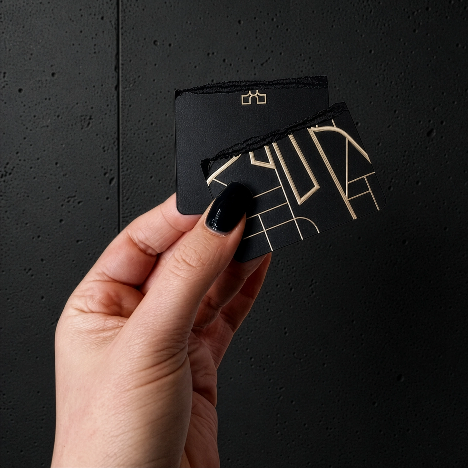
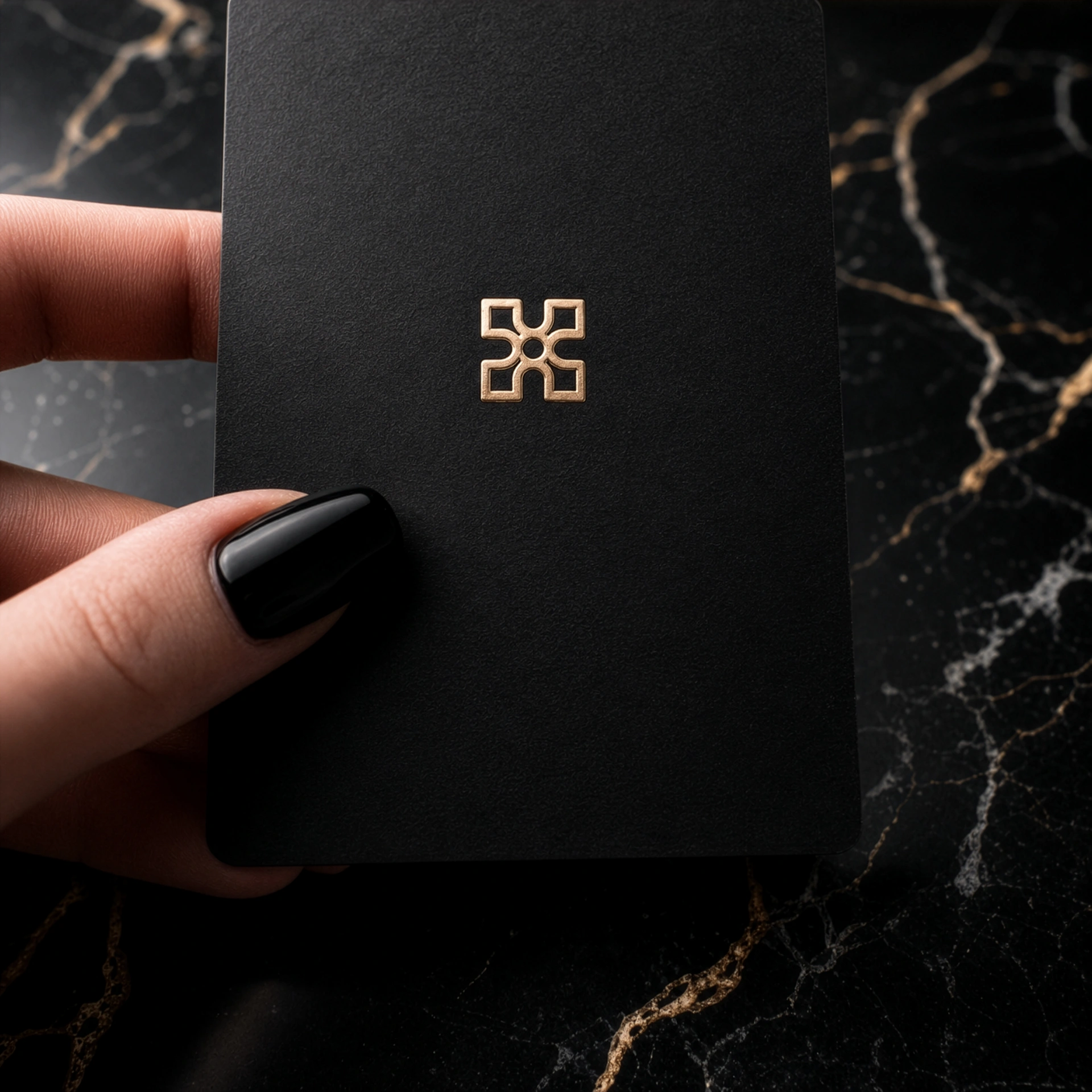
Solid-dyed paper is made by an entirely different technology. The dye is added to the pulp while the web is still being formed. Thanks to this, once cut, the edge stays matt black. Materials of this kind are of higher weight and offer the hands a pleasant resistance.
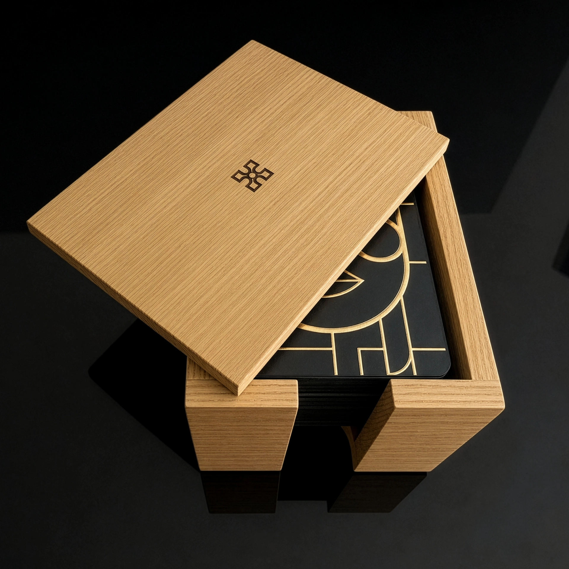
The weight of the material has a psychological function here – it works as a grounding mechanism. A card with perceptible weight occupies the hands and demands an attention a screen does not need. We focus on the here and now, which is the foundation of honest conversation and lets us push away the threat of a relationship crisis after years together. We apply the same rule in the engineering of the oak box.
A canvas for conversations of value
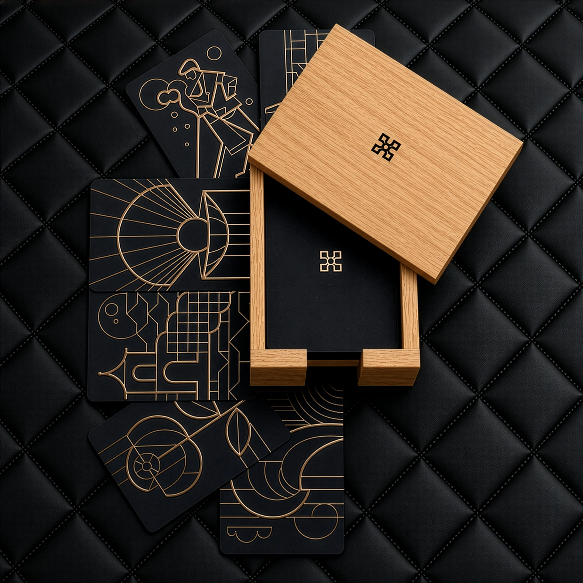
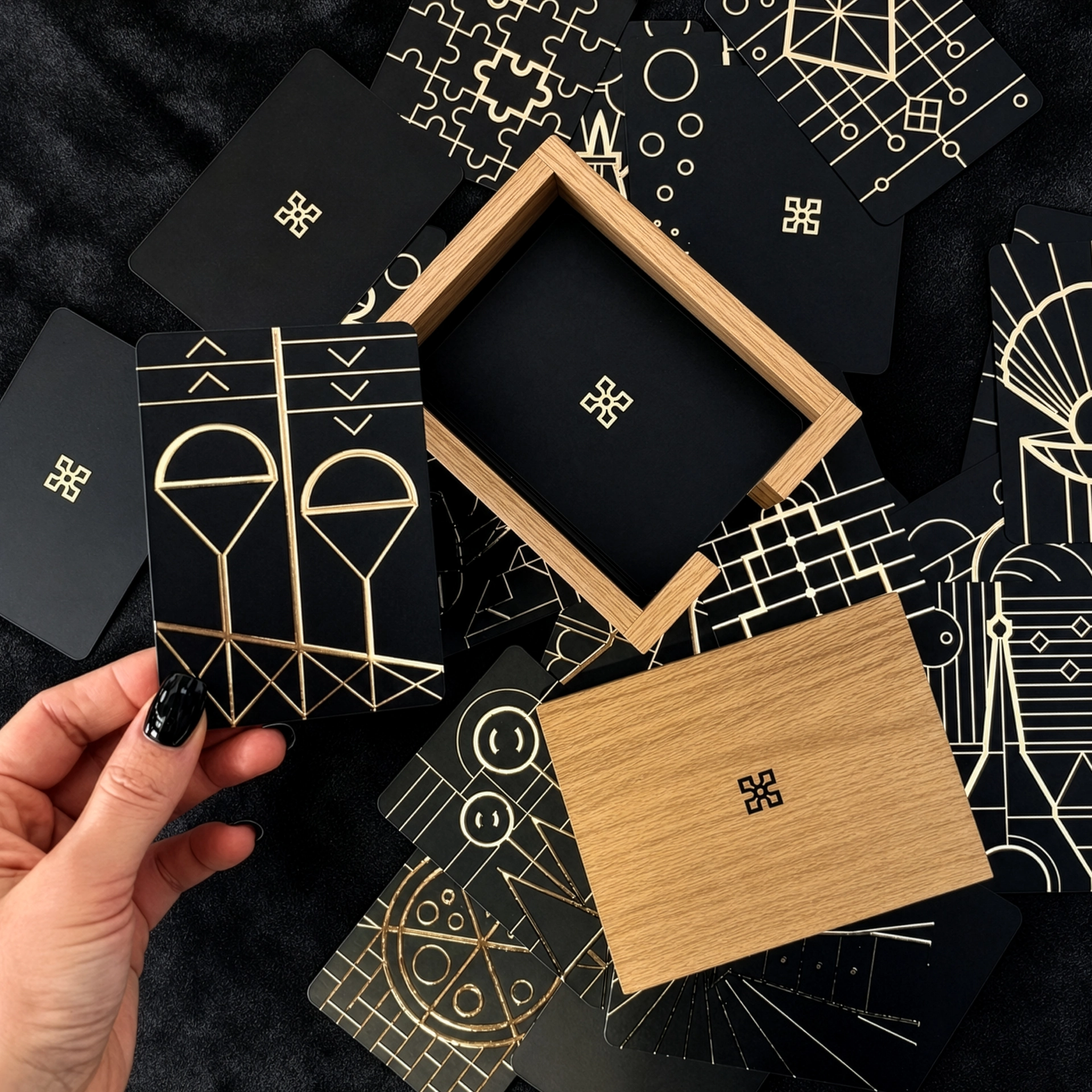
Understanding the singular relation between the weight of matter and the weight of words became the basis for creating the Odoardo Alibi™ brand. Rejecting market compromises, the cards holding 50 deep questions for your partner were produced exclusively on paper solid-dyed black. When you draw a card from the oak box, its edge is as black as its face.
The black foundation allowed haptic 3D gilding to be applied. This construction means the card asks the question, not the person. Black is a perfect background for illustration. The Geometric Noir style makes use of contrast, making partners aware of the meaning of silence and image in communication. Instead of staring at flat pieces of card, one handles a crafted object, which stimulates active listening in a relationship.
Analog luxury in an age of digital noise
Why do we need such uncompromising physical tools today? The answer is suggested by the creator of the Odoardo™ ecosystem:
“The more our daily life becomes digital, saturated with algorithms and virtual entities, the greater the value of matter that pretends to be nothing. Solid-dyed black paper, solid oak, the weight of metal – these are no longer only questions of aesthetics. Handling such matter gives us a rare sense today of tangible anchoring in reality.”
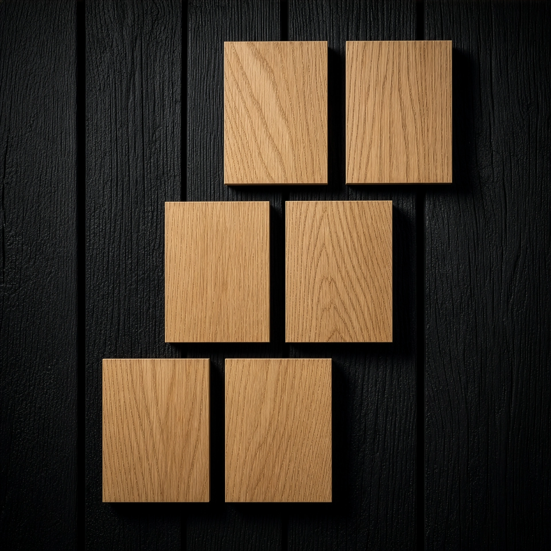
If you decide on an evening ritual for couples using Odoardo Alibi™, it is worth introducing a consistent digital detox before sleep. Such a space can be completed by other solutions that reject screens: collectible prints in raw wood from Odoardo Art™, or the physical contextual interfaces of Odoardo Soul™.
Why a material here has to be real all the way through the cut, we explain in the manifesto.
 Odoardo Soul™
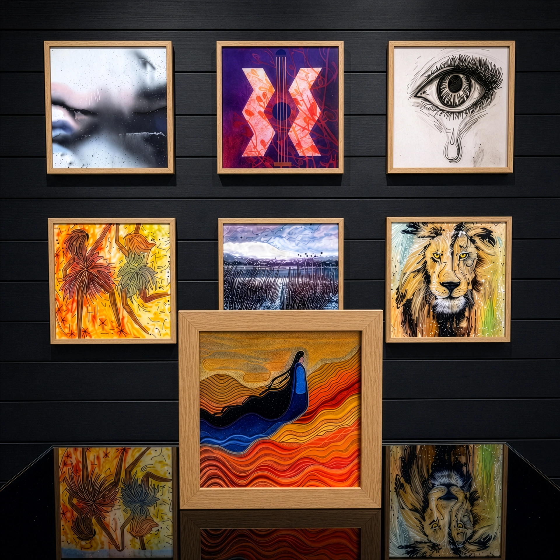 Odoardo Art™
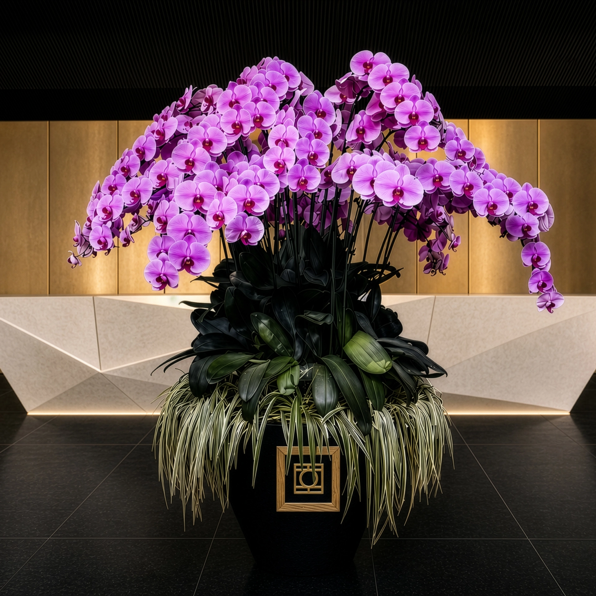 Odoardo Lens™
 Odoardo Space™